Create Charts and Dashboards Using Microsoft Excel
Featured Project Highlights
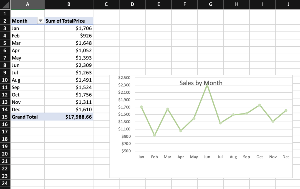
This certificate demonstrates hands-on training in transforming raw sales data into clear, actionable insights using Microsoft Excel. Through a guided project, I learned how to create and format PivotTables to explore different dimensions of sales performance, then visualize those findings using line, bar, and pie charts. I applied best practices for chart formatting to ensure clarity and impact, and brought all visuals together into a cohesive dashboard that provided a complete snapshot of business performance.
The course emphasized practical, job-ready skills, from uploading and working with datasets in Microsoft Office 365, to designing professional-grade dashboards that communicate data effectively. This experience sharpened my ability to analyze sales trends, compare performance across categories, and present results in a way that supports better decision-making.
Disclaimer: I do not own the data within this project, and it is part of a certification project. The course can be found here: Link

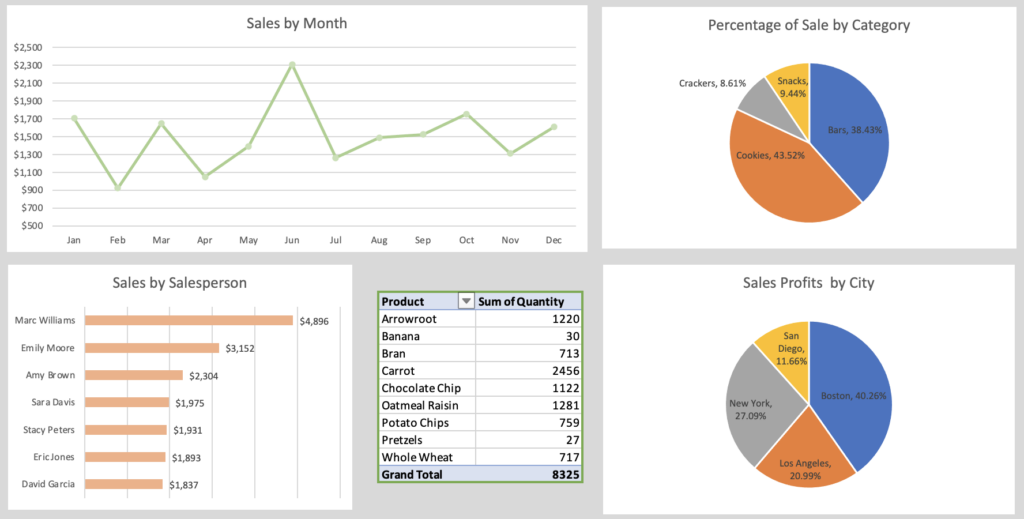


Sales by Salesperson

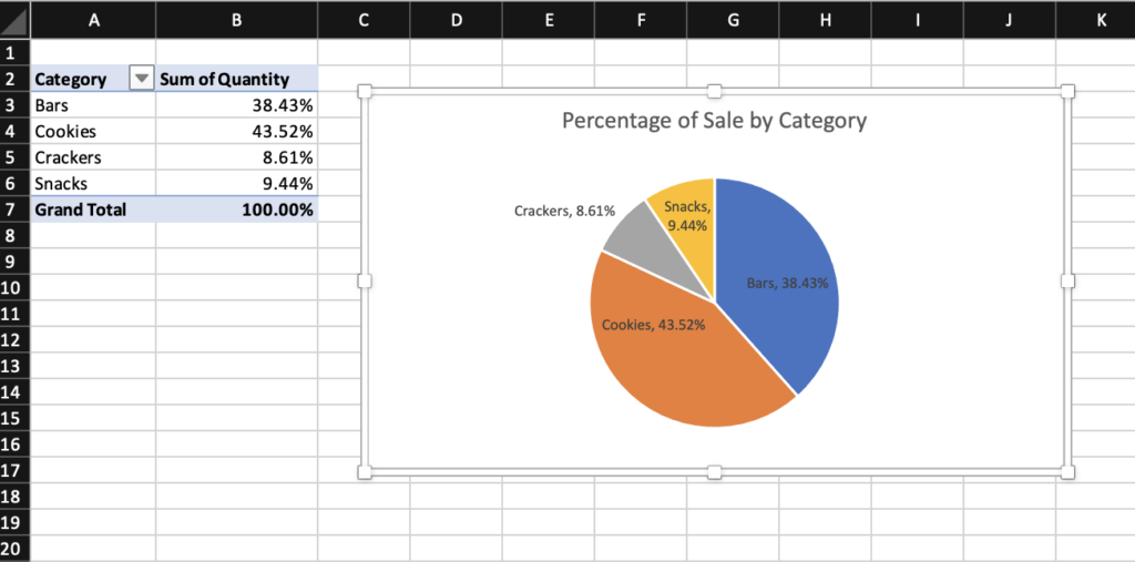
Sales by Category

Sales by City
Discover Our Project Highlights:
Browse a handpicked selection of visuals: